Perhaps you thought you’d paint it white and be done with it. Not a bad choice; white is indeed one of the most timeless cabinet colors. But what kind of white? Not every white looks great in any light.
Stressing over cabinet color is practically a tradition in kitchen remodeling. Nuance matters in creating a shortlist of colors we’ll enjoy for years. The lighting, other fixtures and materials, style of cabinets, and finish of the paint are all big factors.
Drama, warmth, cleanliness, or subtlety? Keep reading to get five of the best cabinet colors for timeless kitchens.
What kitchen cabinet colors should you avoid?
It depends on what exactly you’re trying to avoid. If you fear a kitchen cabinet color looking outdated or clashing with other elements, consider this:
- Golden yellows mess with the overall aura of a kitchen. Pale, buttery yellows and even citrus can work in retro or cottage kitchens. The bolder, deeper yellows that lean mustardy or gold are better for hardware and unexpected features.
- Bright reds (think chili or tomato) tend to come on too strong. It can be difficult to find a backsplash or counter that complements it, too, especially if you want stone. Rustic, iron-rich reds are worth exploring for backsplashes and accents.
- Blues in country or cornflower shades have proven to be a fad. Again, these can be marvelous accent colors, especially in backsplash tiles, but their time splashed all over cabinets is up. (Stay tuned for a timeless blue you can use.)
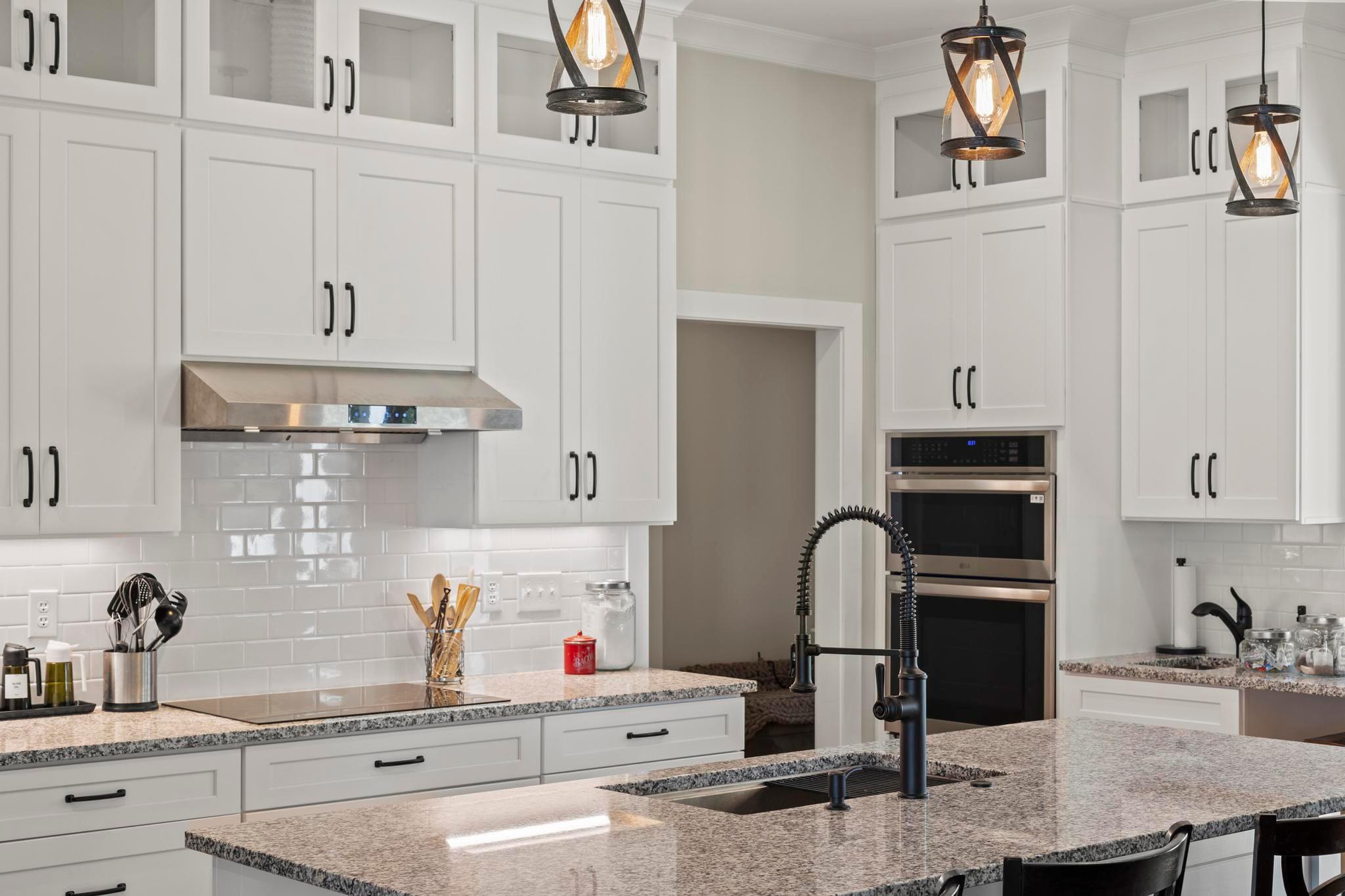
- For a timeless look, stark white is better left in the bathroom. Certain other types and tones of white are some of your best choices. But common semi-gloss snow-white shows imperfections and wears easily. It also looks like no thought was put into the design.
Timeless cabinet colors for your kitchen remodel
Time to design a kitchen with style and longevity. Take a closer look at these cabinet colors and consider integrating them into your remodel.
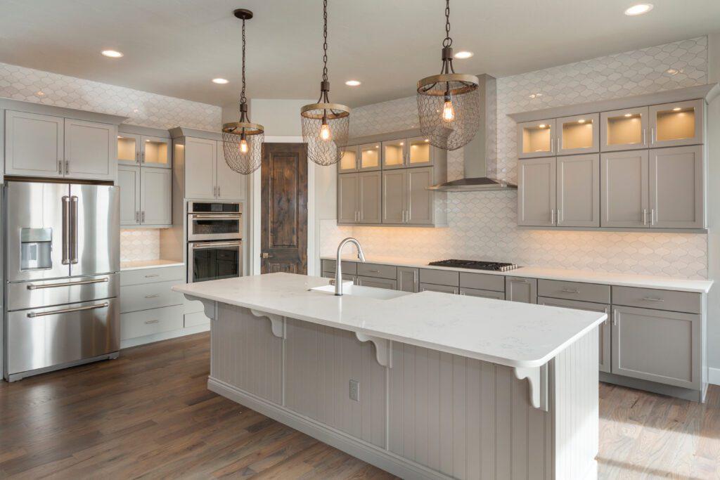
1. The subtlest taupe
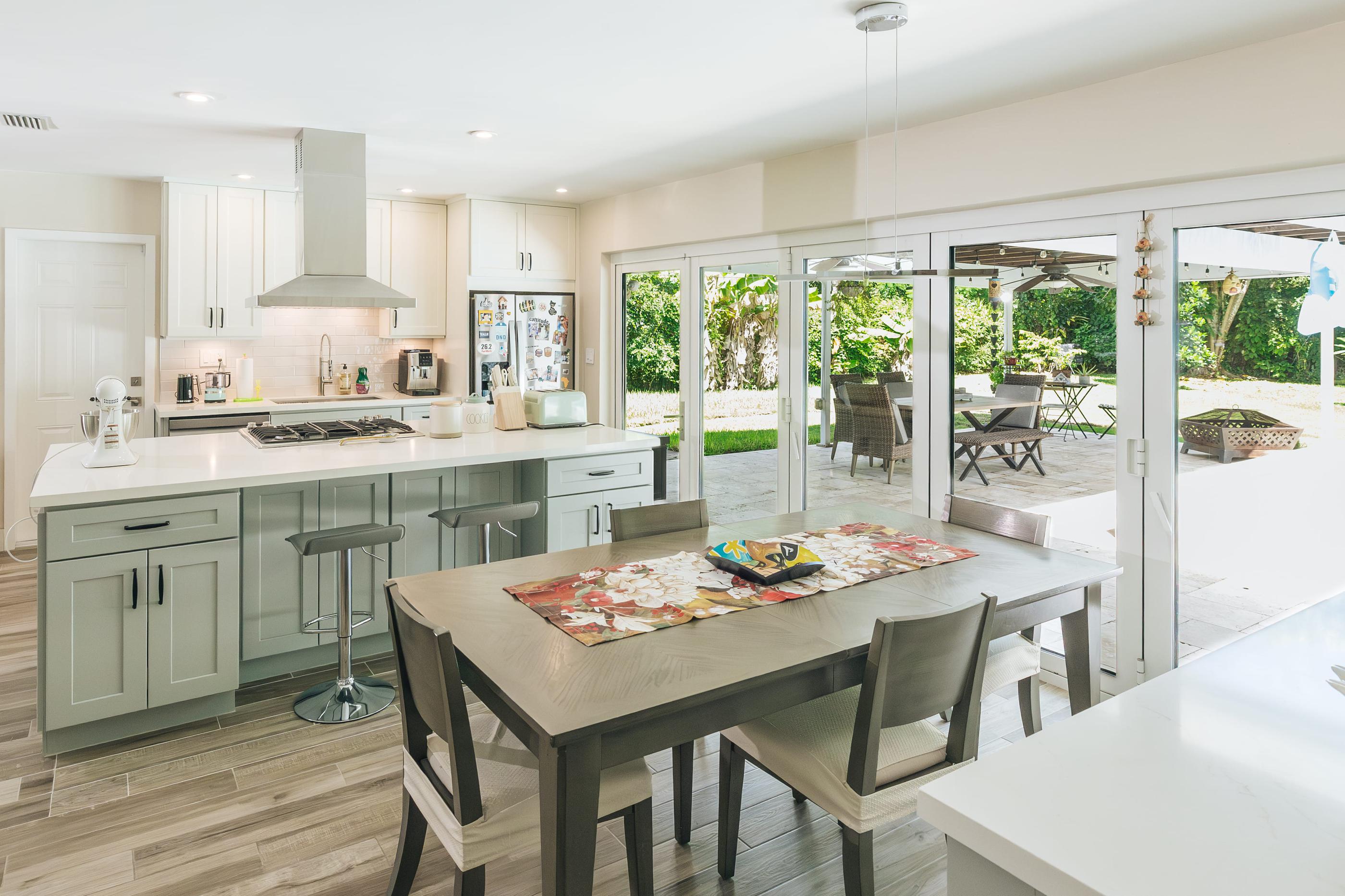
If you’re looking for a cabinet color to go with absolutely everything, we put it right up front. Taupe is both modern and timeless in kitchens, looks great in all lighting schemes, and doesn’t show damage and wear the way white does.
It’s also the perfect cabinet color as a foundation for mixing metals. Burnished bronze light fixtures, brushed nickel faucets, and stainless-steel appliances all mingle nicely here.
Not to mention, it’s dead-simple to pair subtle taupe cabinets with your choice of flooring, countertops, and backsplashes. A truly timeless, customizable choice.
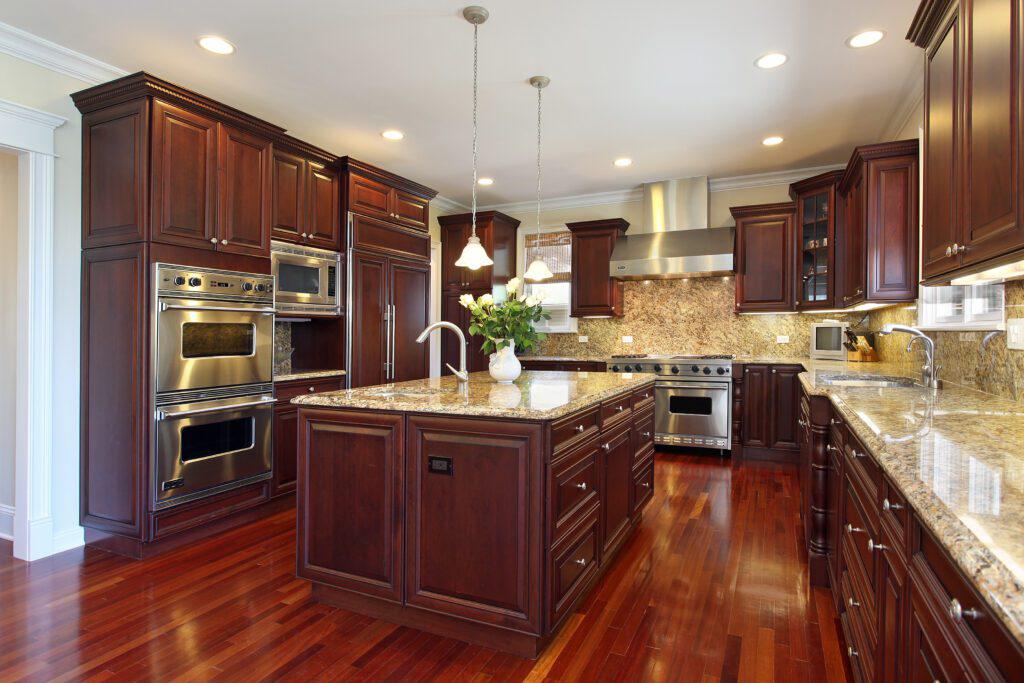
2. Rich cherry stain
Cherry took a star turn in luxury kitchens not so many years ago. Before that, it was the main character in traditional and country kitchens. It seems every time has had a place for cherry wood, which is just one reason we still love it for kitchen cabinets.
Rich cherry wood cabinets are strongly associated with quality craftsmanship. They add warmth and depth and look great with other natural materials like granite. And it’s one of the best natural, traditional colors to pair with stainless steel.
Still in doubt? Just make sure your stain isn’t light enough to lean orange. The deeper the hue, the better the payoff.
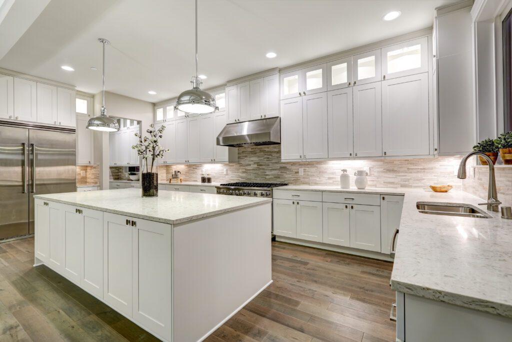
3. A softer white
Warm, creamy whites are good if you want something crisper than taupe, but more subdued than snow. A soft, satin finish prevents imperfections and fingerprints from sticking out like a sore thumb.
Whites that lean warmer are often described with words like ecru, dove, or linen. They’re perfect for making quartz countertops stand out and make cabinet panel details pop.
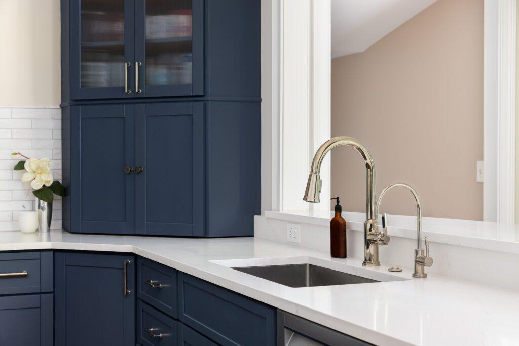
4. Elegant navy
Some cannot resist a bolder, more dramatic choice, and we have to respect that. If any can’t-miss cabinet color has timeless appeal, it’s navy. It’s the most sophisticated of all the blues and emphasizes other design elements like nothing else.
Gold hardware, gleaming quartz, roughly hewn butcher block, smooth tiling–it all looks stunning with navy. If you’re trying to merge on-trend style with classic color, try using it in a two-toned kitchen.
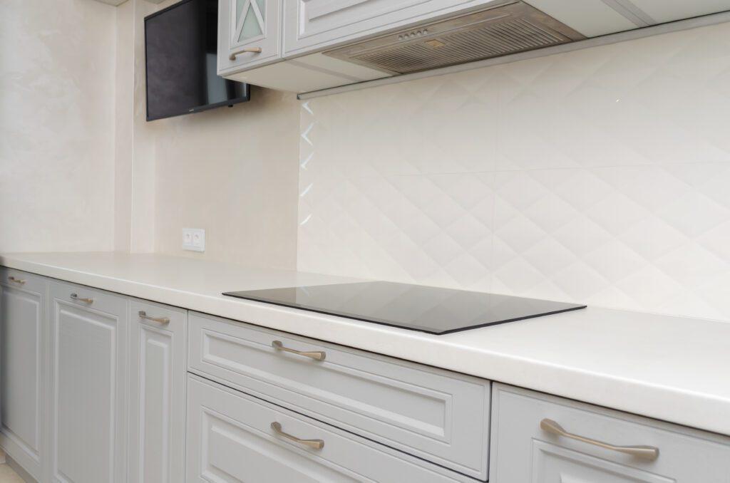
5. Pale, powdery gray
Cabinets that veer into mid-tone primer gray look too contemporary, if not simply unfinished. Diffusing it into a softer, powdery tone offers the cool neutrality we want with the scalable subtlety that makes it timeless.
Adaptable and complementary, your kitchen can go through multiple facelifts and updates without needing a new cabinet color. It’s cool, has character, and is a great base for adding texture. Whether that’s a tiled backsplash or richly dyed runner rug, pale gray makes it look right at home.
Reasons to choose custom cabinets
You can’t splash color on any old cabinet face and call it timeless. Here are a few reasons why adding fresh color to quality custom cabinetry is what you’re really looking for:
- Getting the cabinet style right. Traditional raised profile, classic shaker, or contemporary slab will all influence how well the color plays on your cabinets.
- Proper construction. Joints, hinges, and the type of plywood all factor into how a cabinet holds up with daily use–a far more critical consideration than color.
- The right finish for your color. High gloss, matte, and glazed cabinets all make colors appear differently, especially in varying lighting.
The Designery can effectively guide you through every choice you need to make. From professional design advice to hundreds of cabinet options and custom construction, a timeless kitchen begins here. Schedule a free meeting with a designer to learn more.