Flooring and paint are the foundation of a room’s design. When they don’t work well together, it isn’t always obvious to the visitor why they don’t care for the space. You yourself may never fully come around and settle into the design. All of the redecorating in the world won’t fully rectify the problem.
As is the case with many remodeling projects, impatience and poorly applied inspiration lead to hasty decisions and underwhelming results. Your furniture and fixtures can wait–take your time exploring the best flooring and paint color combinations.
Tips for choosing the best floor and paint color combo
Recommended color combinations are helpful–in theory. As most homeowners know, all kinds of factors unique to your space will influence how great the results actually are.
The first tip for success is to swatch the paint near the floor, in the light most common to the room. The type of lighting, from day to night, will change the appearance of the two together. Your floor may look much warmer in the evening lamplight. Full sunlight can reveal subtleties in what appeared to be a straightforward neutral.
Next, put the function of the room first. Dramatic peppercorn gray-black walls may look stunning next to a honey oak wood floor. But is that how you envisioned your children’s playroom? Save it for your home office instead, perhaps.
Finally, keep your eye on creating balance. The eternal question with paint and flooring combinations is whether you want to contrast or complement. In either case, clashing undertones or too many bold elements can sink the whole room.
Popular paint colors for gray flooring
Gray flooring has become so popular over the last decade-plus that people are starting to complain about its omnipresence. However, that won’t change the fact that gray LVP is durable, versatile, and widely available.
The best paint colors for gray flooring:
-
All crisp whites
-
Light neutrals, including more grays
-
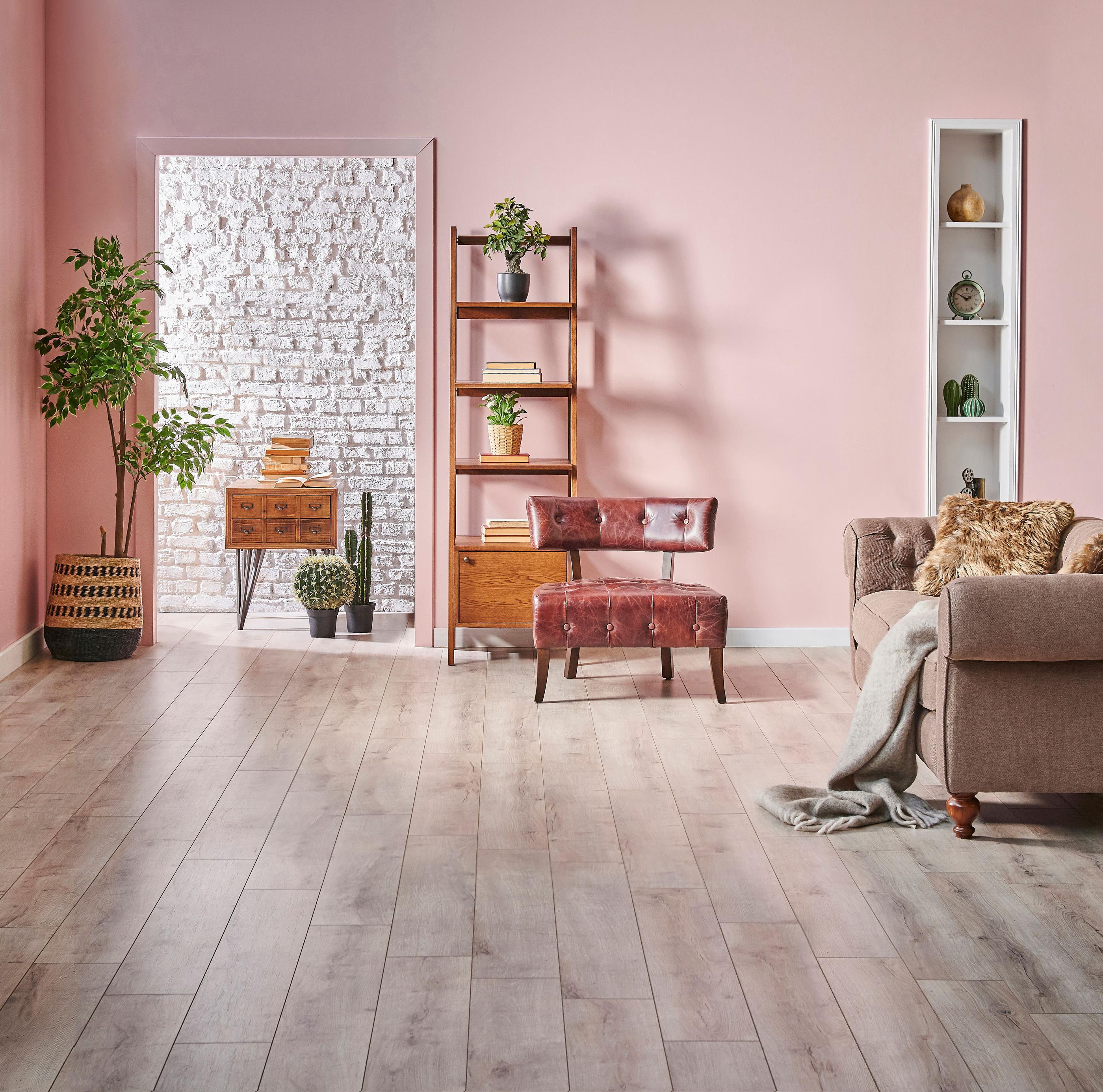
Powdery pastel pinks and purples
-
Soft, cool greens
-
Deep charcoal
-
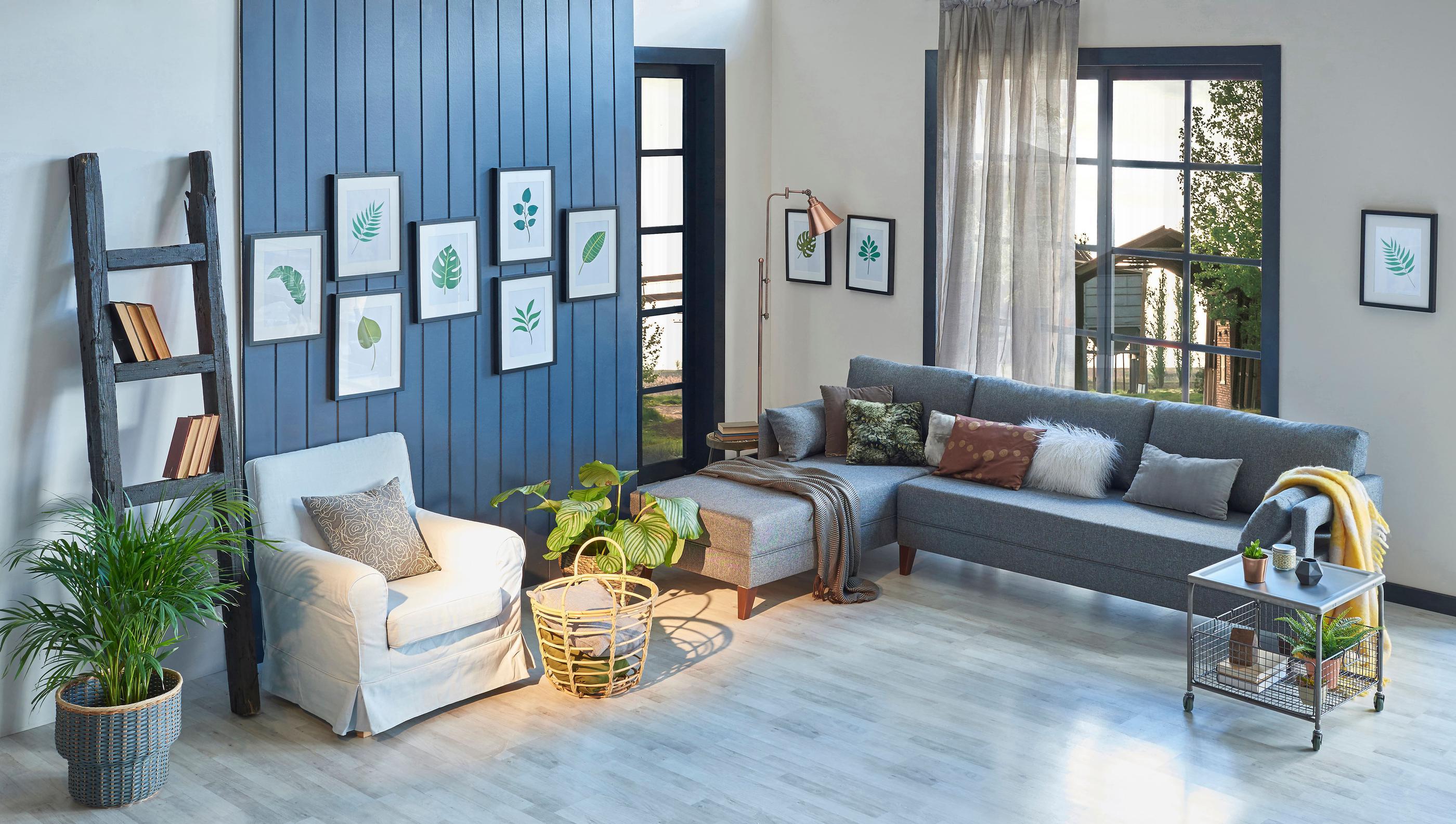
Dusty blues and navies
What to consider avoiding:
Reds and yellows. Warm tans and beiges, rusty reds, and chocolaty browns do not look nearly as inviting with a cool-toned, trendy gray floor.
Making gray work well is all about undertone. Choose a gray floor, and you’ve essentially already settled on a cool palette.
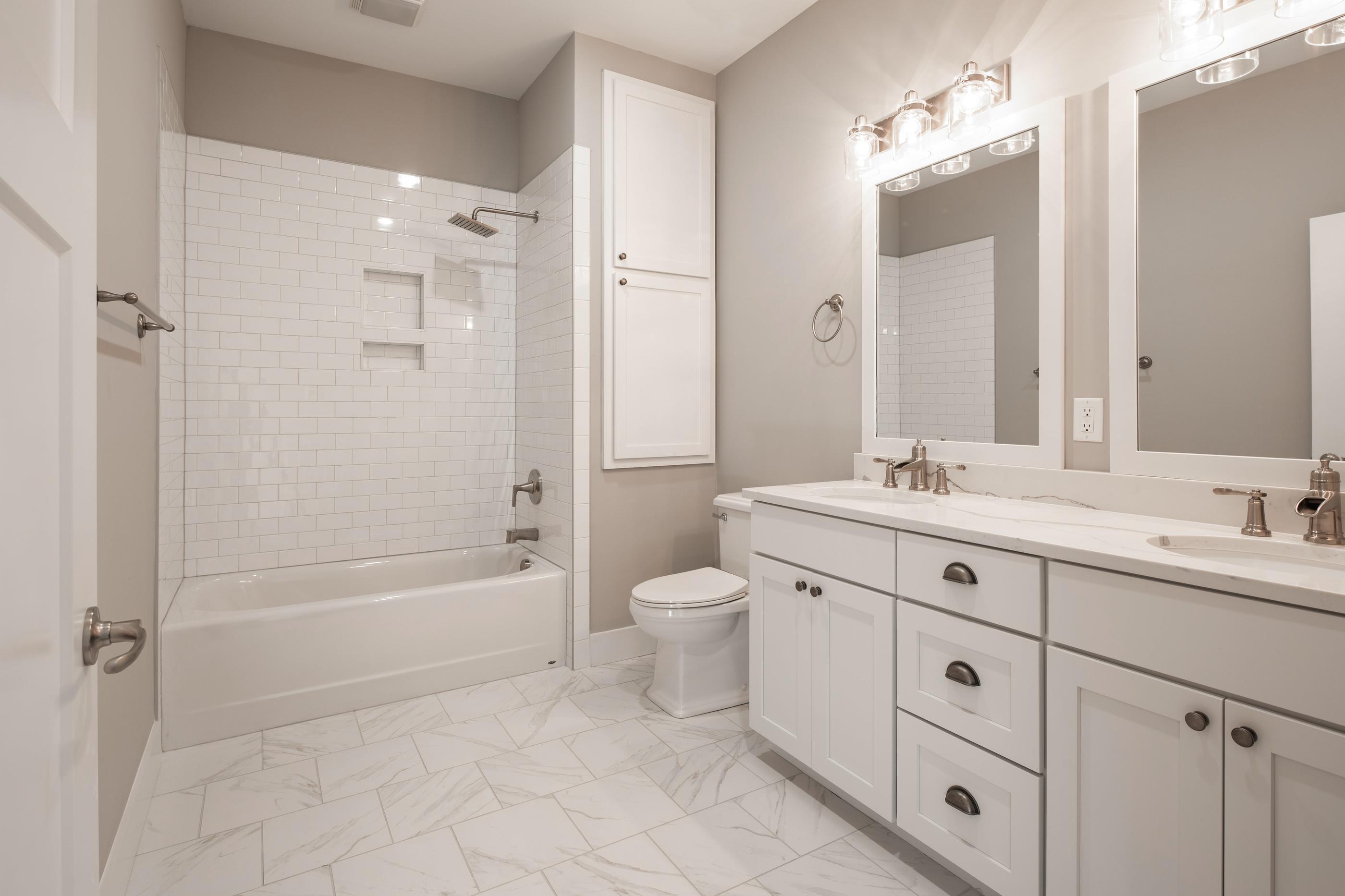
Paint colors for white or light neutral tile floors
Tile floors are long-lasting, sanitary selections for kitchen and bath alike. They’re also the ideal floor for making a firm decision between harmonious design and striking contrast.
Start swatching the following:
-
Similar, complementary whites
-
Softer, muted pastels (think peachy pinks and muted mauves)
-
Timeless taupes or greige
-
Earthy forest greens
-
Rich navy blue
-
Dramatic obsidian black
What to consider avoiding:
While bold is great, bright can be a mismatch. Paint colors like a citrusy orange or vibrant fuchsia can make clean, smooth tilework look too clinical.
A possible workaround for this is darker grout. Black or charcoal grout can create a geometric grid that looks less sterile and more prepared to play nicely with brights.
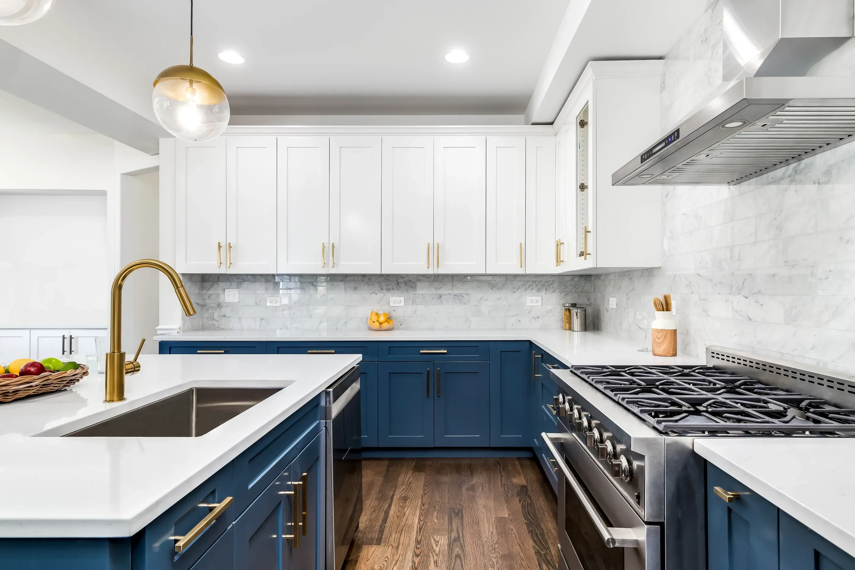
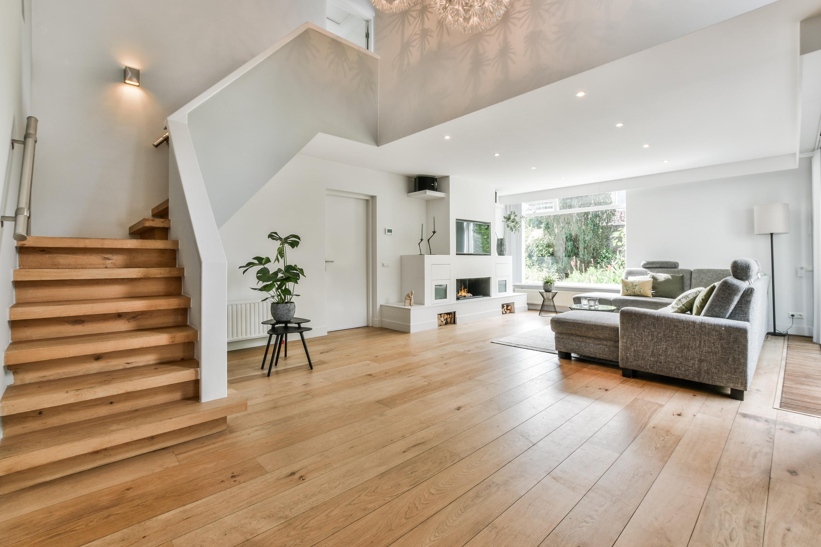
Wood flooring and paint color combinations
Whether you’re working with hardwood, engineered hardwood, or wood-look LVP, let the undertone ultimately be your guide. Paint with very strong undertones, for instance, may not be ideal with oak that looks especially yellow.
These suggestions help us brainstorm around the depth of its color.
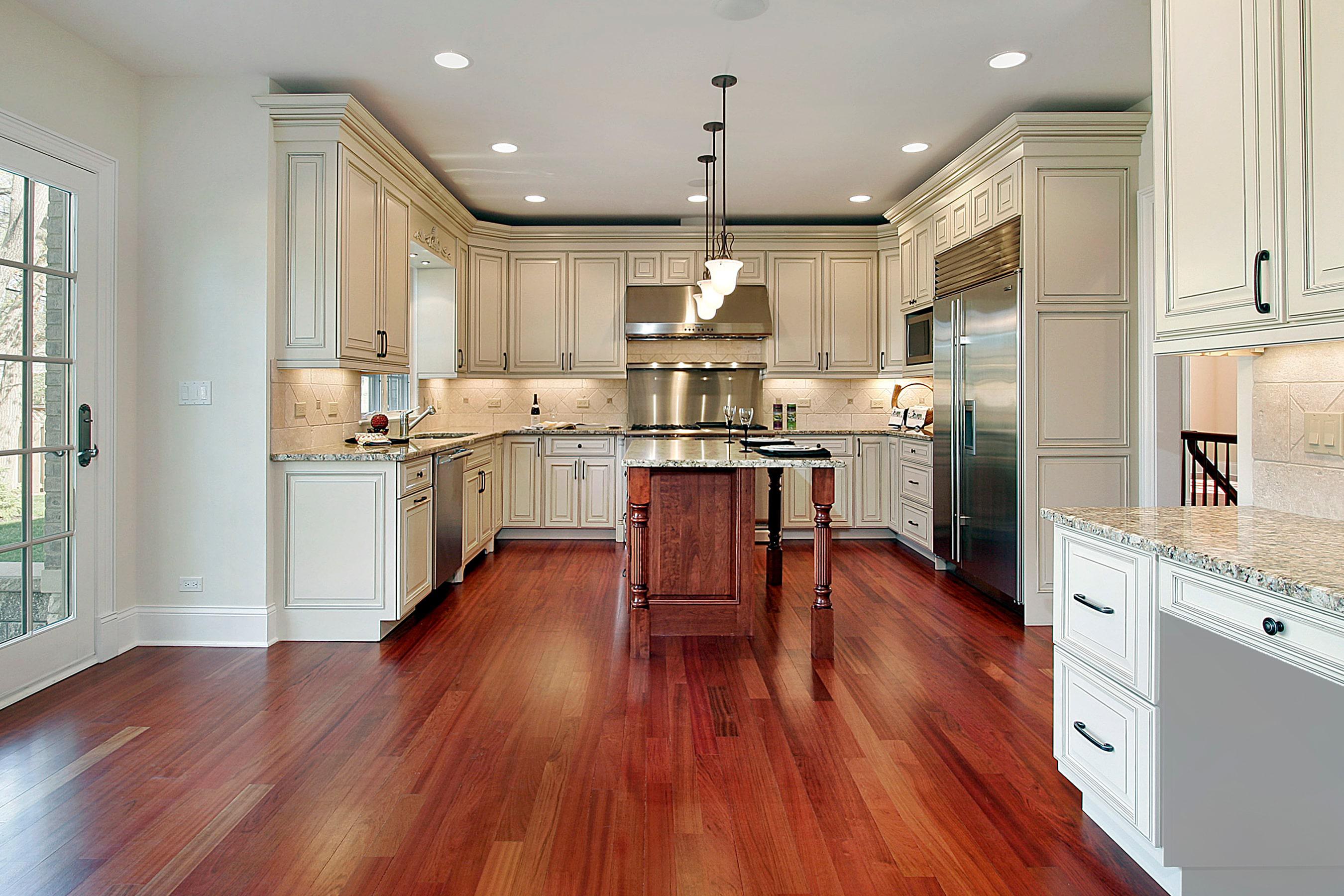
Dark wood flooring
Whites and neutrals of most kinds highlight the depth and richness of dark wood. Eggshell, taupe, and dove gray are worthy candidates. If you prefer more color, try pale robin’s egg blue and other soothing shades.
Medium wood flooring
Medium wood flooring tends to have a warmer or reddish tone. Creams and whites are safe picks, as are many muted pastels. Think about neutrals “tinged” with color. Think blush-infused warm taupe, greens brought down to the ground with grays, or grays slightly warmed with a hint of beige.
Light wood flooring
Paint paired with light wood flooring can either make it even fresher or lend itself to a more sophisticated design. Icy whites and pale, salt-washed seafoam greens are good tries for the lighter end of the spectrum. Deep charcoal or your darkest cool blues can feel natural with lighter, honeyed wood.
The Designery helps you find the perfect match
Creating a harmonious home rarely results from snap decisions. You can solicit opinions from your friends, loved ones, and coworkers. Or, you can cut to the chase with a professional designer.
Get more flattering alternatives, reliable inspiration, experienced guidance, and more–all with your budget in mind. Your initial consultation is free.