Is green replacing gray? Where is beige the rage? Can you paint a small room navy blue? Conflict over what constitutes trending colors, your personal preferences, and an avalanche of photo inspiration. All of it makes choosing a color for each room of your house harder than it should be.
If you’re open to advice, keep reading. We’ve got options and ways to help you choose the right paint colors for each room.
How to choose the right paint colors: Rules regardless of the room
Before we proceed, here are some factors to consider that’ll improve how satisfied you are with the results.
Think about lighting
How much light in the room is natural versus artificial? Bright, direct sunlight will impact how the color goes over. The strength and placement of artificial light will do the same. Bolds and brights especially will appear much different day to night if there are lighting variances hour by hour.
Sample and swatch
If you’re not dead-set on a particular hue, you can’t avoid this step. Swatch options on the wall and inspect the dry results. Some colors won’t look exactly like they do on the card once you have them applied in your environment.
Careful with those proportions
Certain colors will become the entire focal point of a room if there’s a lot of available space. If more than 60% of the visible surface (that’s with furniture, appliances, hanging décor, and other finishes) is painted, that color will be a dominating force.
Don’t forget trim and ceilings
Tour each room and take note of trim, baseboards, ceilings, chair rails, and other details. Start thinking about coordinating or contrasting shades to complement your ultimate choice.
If you don’t like it, don’t use it
Don’t be peer pressured into a color, or waver on something in hopes it’ll grow on you. What seems like a minor-to-moderate compromise now could become unbearable down the line.
Tips for choosing the right paint color for every room
The following paint color options combine what’s new and fresh with timeless crowd-pleasers. There are also some room-specific considerations to help guide you in the right direction.
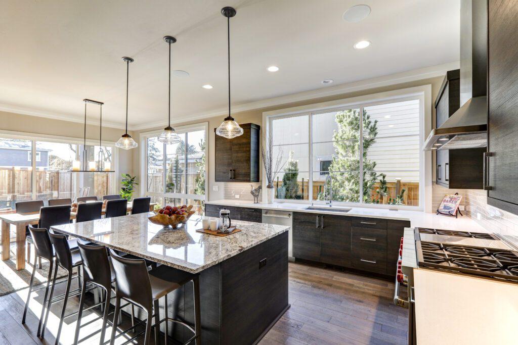
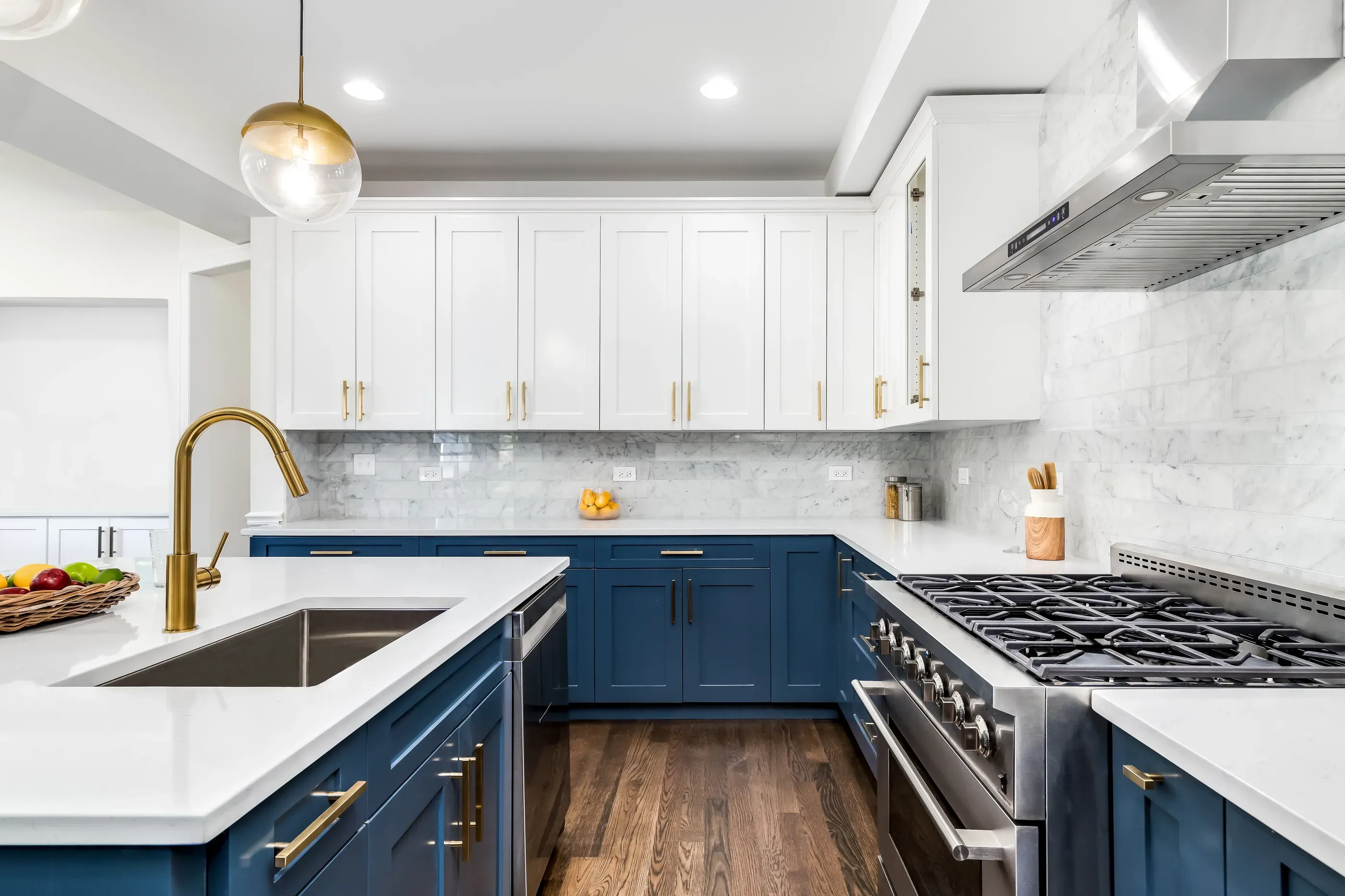
Kitchen paint colors
The kitchen has a lot going on that has nothing to do with paint. Here’s everything you have to weigh when choosing a kitchen color:
- Color and style of cabinets
- Color and finish of appliances
- Color and material of countertops
- Other furniture, like islands and dining tables
For this reason alone, many go with timeless neutrals, whites, beiges, and soft grays. You can always add more personality and color with textiles, backsplashes, and even lower cabinets in a striking two-toned kitchen.
Bonus: Bold choices
If you came here hoping for anything but neutral, experiment by swatching on shades of deep, dark blue, rustic red, or matte black.
These colors can add even more impact to rich woods, high-shine hardware, and other finishes you want to stand out. They can also be used as accents, such as on an island.
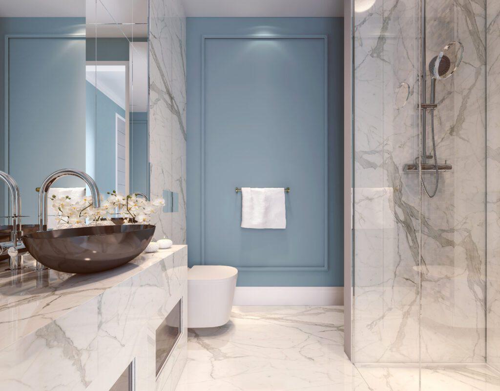
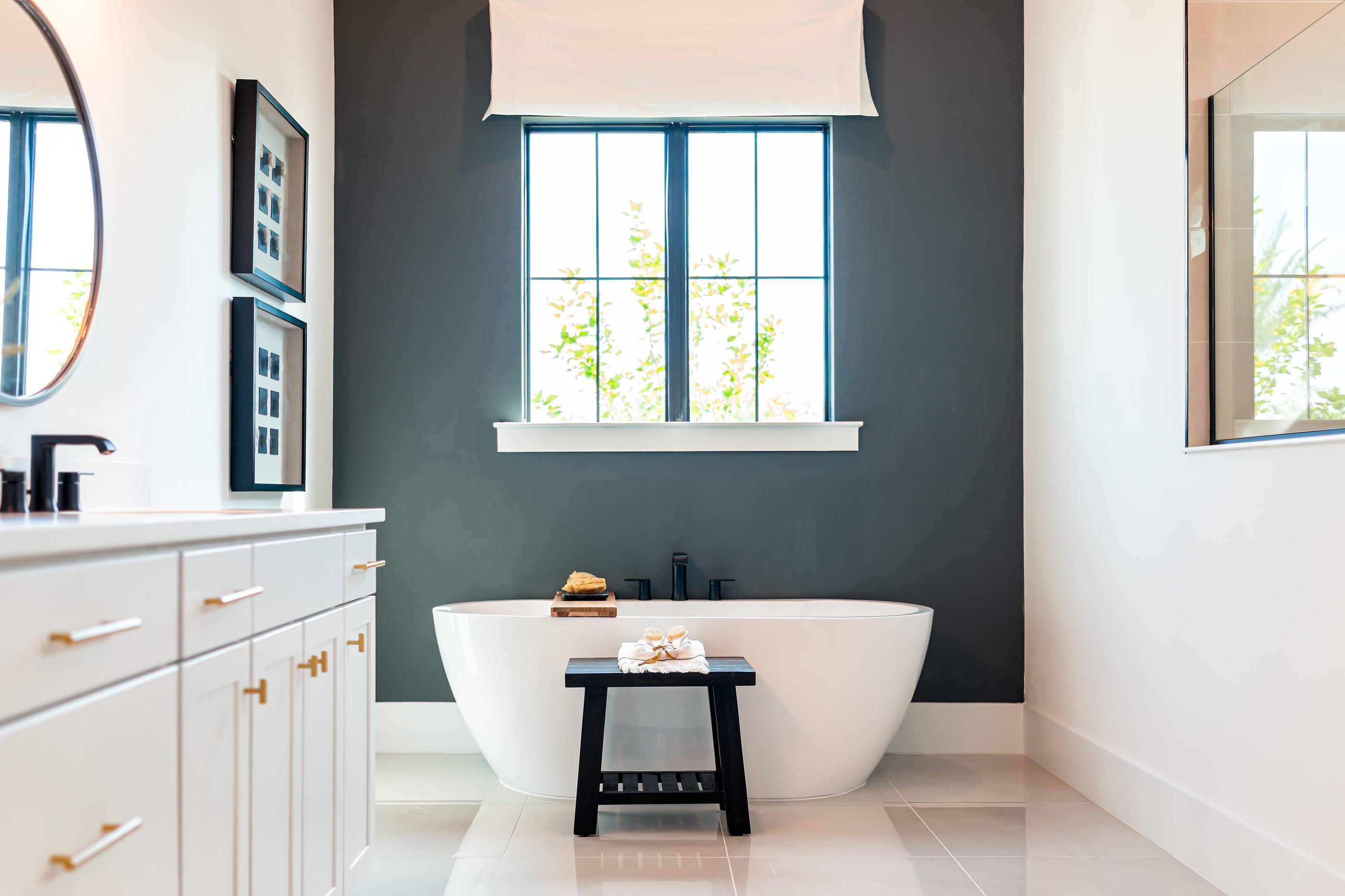
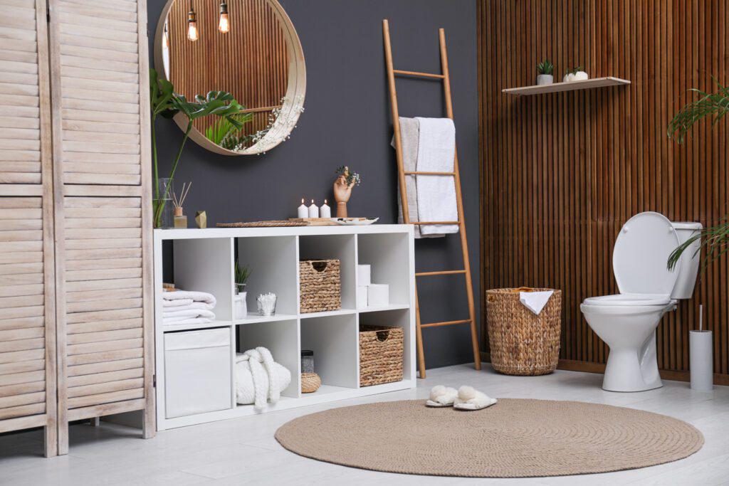
Bathroom paint colors
Like the kitchen, you have fixtures and cabinets to think of. The tilework and flooring also become more important, since this is usually one of the smallest rooms you’ll paint.
However, the bathroom’s status as a private space gives you more breathing room to get creative and choose paint based on how you want to feel. Some options:
- Grays, from pale to slate, are soothing and sophisticated for spare, spa-like bathrooms.
- Whites are always in style for a clean, uncomplicated canvas.
- Shades of pink, from baby to blush, cast a comforting glow when paired with layered lighting.
- Mushroom and warm taupe can help visually striking hardware or intricate tilework stand out.
- Pale washes of cool blue and aquamarine are at once refreshing and relaxing.
- Sage and mossy greens enhance a connection to nature in bathrooms with wood details or natural light.
Bedroom paint colors
Should bedroom paint be calming, cozy, or the ultimate space for personal expression? With the right paint colors, it can be all three. Here’s what we need to bear in mind when painting this room:
- The color and finish of bedroom furniture
- The amount of time spent in the room
- The lighting–many darker colors feel better with strategic artificial lighting
- Any textiles you want to keep using–shades, rugs, comforters, etc.
Because sleep is so important, we’ll defer to color psychology for recommendations. Softer, lighter shades of green can impart feelings of tranquility and rejuvenation, while some research has suggested that certain shades of blue lead to better-quality rest.
If you want the area to feel lighter and more spacious, go for the whites, creams, and lightest icy grays. For something that keeps it light but is a bit cozier, look into taupes and warm neutrals.
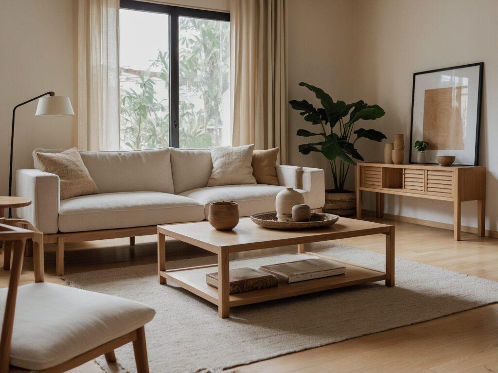
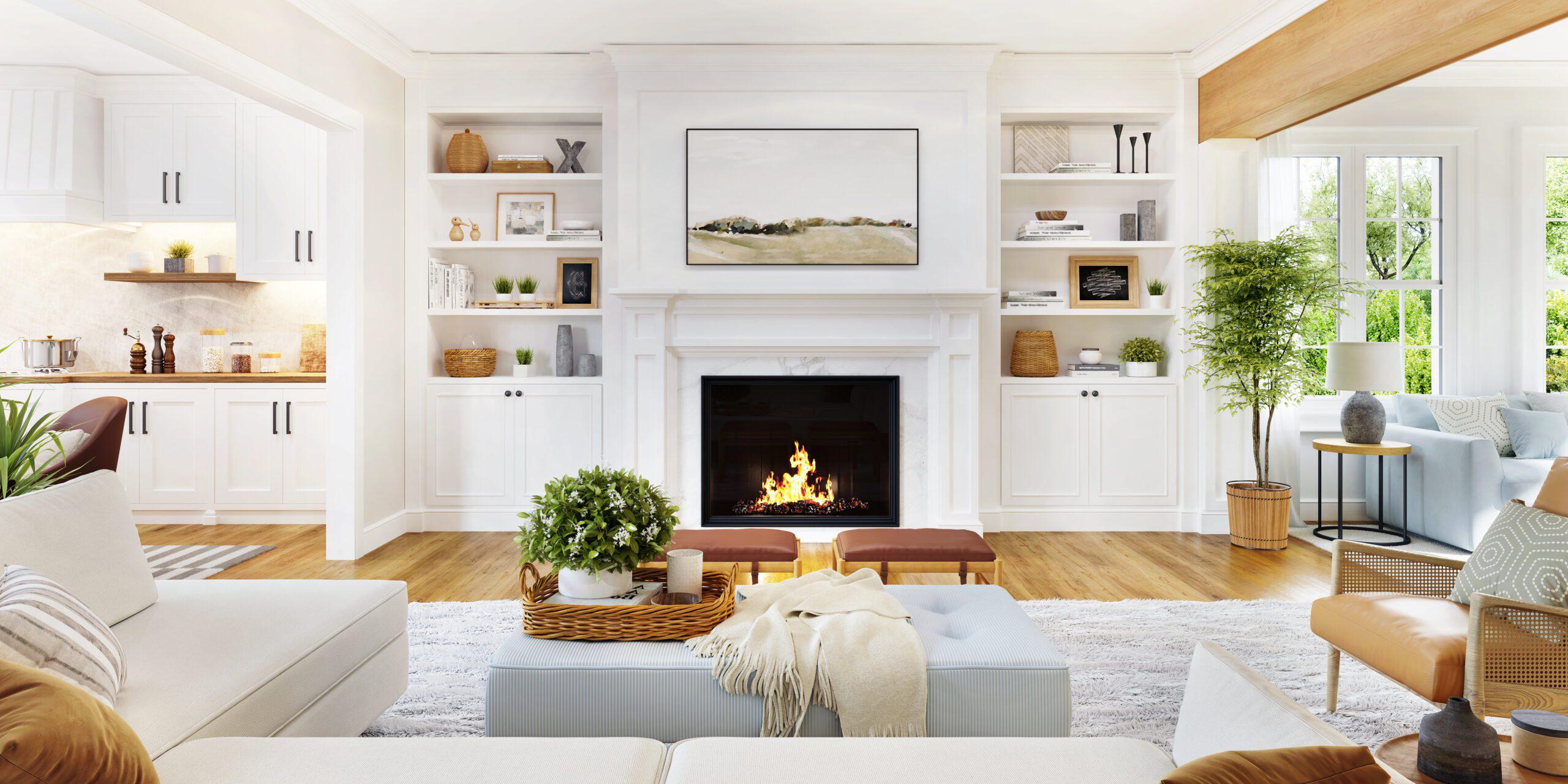
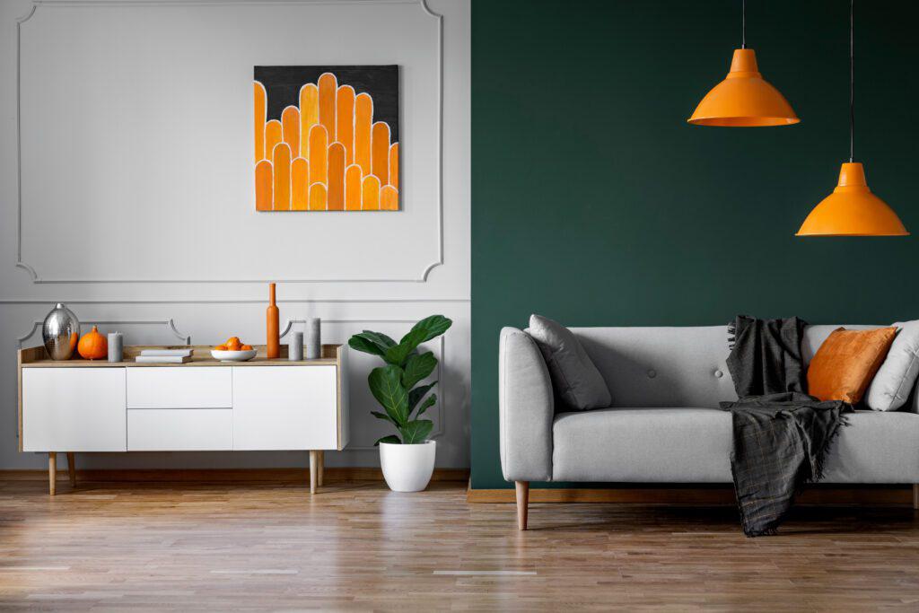
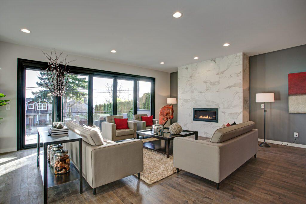
The best colors for living rooms
As the most communal rooms in our homes, living rooms, dens, dining areas, and open floor plans seem to present the narrowest (yet weightiest) options. These are the spaces where neutrals aren’t just “popular” or “timeless.” They’re the go-to choices to avoid overpowering furniture, photos, rugs, and other décor.
That’s why it may be worth choosing not one, but two, complementary shades. These spaces provide the best canvas for accent walls, trim, and other features.
For instance:
- A base of pale beige with tan or khaki paint on trim and around windows can enhance architecture.
- A light Zen green with cool off-white trim and molding lends itself to a relaxing, sanctuary-like feel.
- A subtle mushroom with pewter-toned green below a chair rail or inside of built-ins looks bold enough to be interesting without distracting.
Don’t get stuck–speak to a designer!
Why isn’t a particular color clicking? Because you need to see the right options for your belongings, property, taste, and lifestyle. The most unexpected shades are knockouts when put in the right context.
It isn’t high-risk or out of range to consult a pro, either. At The Designery, your first consultation is free.
Choosing the right paint colors FAQ
What color paint never goes out of style?
White. Or to be more specific, cream, alabaster, ivory, vanilla, bone, flax, linen, seashell, eggshell, smoke, and champagne. All of these can have different effects on your space, depending on your lighting, the type of wall, and other fixtures in the room.
What colors make your house look expensive?
Neutral palettes are typically the go-to for luxury properties. However, going boldly dark or vividly jewel-toned in just one area can add drama or elegance that scales a room up.
More often, expensive-looking properties use fine materials, like quality stone and polished wood, as well as custom finishes.
What is the rule for interior paint color?
The 60/30/10 rule is commonly used to determine how much you should use in a group of three colors. If you have three paint choices:
- 60% goes to the dominant color
- 30% goes to a color that complements the dominant color
- 10% is reserved for an accent color